I’m looking at Visme here – new kind on the block in many ways. So new, in fact, the beta flag is still flying. Why am I looking in detail at what’s experimental software? Basically ‘cos it didn’t annoy me too much in a quick trawl of where I should spend my time. It’s passed the ‘am I going to spend time looking at it?” test, so now it’s time to give it a more serious test drive.
Basics
First impressions are positive – it’s clean, smooth and it’s pretty easy to see what you need to do to get started. The creation interface is very similar to the competitors, with a column of options on the left that you click-and-drag to the main body of the screen to add to your slides. It’s hard to get confused (that’s not a challenge). It might have been the lag on my internet connection but a couple of times I did manage to get a little confused as I pushed a button and nothing happened for a moment or two. Once you realise that it’s just a question of waiting for a second that’s not a real problem, but it did confuse me a bit, given that I knew nothing about the software and I was adopting the standard (around here) learning method of ‘poke around and see what happens’.
You may mock, but let’s face it, if the UI is badly designed enough for me to have to read a manual, it’s too badly designed to make me want to use the software in the first place.
So far, so good, I can easily see how to add text, images and various widgets to the slide.  My personal favourite (which I can even see a use for in some training sessions!) is to click and drag a clockface onto your slide, showing the time (if you want). Customisations options are a bit limited, but it’s a nice toy! (Personal aside: If you’re listening guys, I’d like to see a count-down timer rather than a real time display but that is probably just the kind of use I’d put this kind of toy to, and might not represent anyone else. :) )
Tweaking objects on your slide is pretty easy too. Just select the object and then click and drag one of four dots that appear around it. You can also twist it around by using the icon above, to alter the horizontal. What you see on the right of the clock in the image above is the standard sort of customisation panel. Things like moving objects forward and back is actually easier than for PowerPoint (nice!) – just click on the Layers tab and click to move things up and down the pile.
One particularly nice feature is that the location of this customisation pop-up varies according to where you are on the slide. It defaults to the right but if that would drop it off the edge of your window it appears on the other side. It can take you by surprise a bit, but it’s definitely an improvement on some of the other interfaces I’ve seen.
Oh, and autosaving is a nice touch too, for those of us who sometimes forget to update and save as we go along.
Images
There’s a bank of images ready and waiting for you when you decide you want to include them, just one click away. The search function is pretty smooth and obvious. I’ve barely given the image library a hardcore thrashing, but it seems good. A simple search on ‘dogs’ for example turned up close to 19k results. I didn’t plough through them all to see how relevant the later ones are! ;)

Adding images is as simple as selecting the appropriate icon in the floating vertical bar and doing a search – when you like what you see, just drag it to the big shiny white space on the right.
The search term ‘cloud’ turned up 22 and a half thousand images. When I accidentally searched for “dog cloud” I only got 65 options, but hey, what do you expect! Oh, and the cropping function (accessed by simply selecting the image (click) and then the crop tab in the pop up (another click) is more easily accessed than more or less any other piece of software I’ve tried recently. Very nice.
Uploading your own images is very WordPress-like – clean and simple. Obviously desktop software wins here, but it’s as good as cloud-based software seems to be, generally. A click and drag option would be icing on the cake.
Something that did confuse me at first though, is that scaling functions are in a different place to the bulk of options. It’s a sensible place to have ’em, but they’re not in the pop-up like everything else. It only takes a few seconds to get used to, but it’s not as intuitive as the rest of the system. (The same is true for changing fonts and things for any text you include.)
A quick thought – the images come in all shapes an sizes. I couldn’t see any way of refining the search by things like size or aspect ratio. My desktop alternative doesn’t do that either, but somehow it bugs me a bit more when it’s not offered as for something more integrated. It can lead to the annoying feeling of finding just the image you want but then finding it doesn’t fit like you hoped it would. No biggie, but a tiny gripe.
Transitions and animations
To be honest, this is where some of the alternatives I looked at before fall flat on their faces. By comparison to desktop alternatives such as Keynote (from Apple) there’s a paltry range of options. That said, most people shouldn’t be allowed to use any transitions other than a simple crossfade of some kind so perhaps the lack of alternatives isn’t too big a loss. At least it stops designers who are higher on ego than on talent from forcing random transitions on their poor audiences.
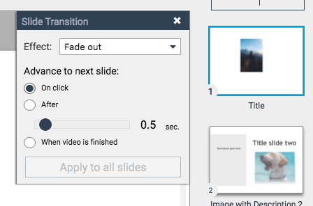 To find the magic buttons, click to show your list of slides on the right of your screen and click to select a slide. The top left of the slide has a gear icon. Click on that and our now-familiar option popup appears.
It’s simple and elegant. Oh, and re-arranging slides is just as easy as you hope – just drag them around in the column on the right. When you’re done, just click to hide the slides for more working space on your current slide.
Animations are where things fall down a bit for me though.
A technique I use often illustrates the limitations quite nicely. I often fade into a new slide and have something then fade onto that slide after a few seconds delay. For example, I might have a question on the slide from the start and then have the answer to that question automatically appear after five seconds. The only way I could find of doing something as simple as that here is to have two slides, and move onto the second slide after a five second pause. Very inelegant, as the initial text now fades out and back in again, this time with the answer. It looks amateur.
There might be a way to do it, but I couldn’t find it despite about ten minutes looking. And if I can’t find it in ten minutes it means that even if the tool is there, it’s badly hidden!
Much like the lack of options for transitions, you might argue that not having this ability, or any of the zillion other options that are so often so badly mis-used in PowerPoint is a blessing in disguise. But for me (and anyone else who fancies themselves as an expert!) this is a bit of a big ask.
Showing and Sharing
 This is a big score. Going into preview mode is as simple as a single click.
What’s more, my set up is getting old now, so it’s not a fair comparison, but for a very simple set of three slides, hitting the preview button got me a glimpse of what my slide deck is going to look like a bit faster than my version of Keynote! Big tick.
 Clicking to ‘Share’ brings up a fairly impressive range of options. The online sharing is great (but see below) but there’s a fly or two in the ointment. The download options gives you:
- jpeg
- png
- html5.
It’s not a bad selection as static, un-editable options go, but the brutal fact remains that it’s static. You can’t really expect to show presentations as a bunch of PNG files! So here your options are either to download the static version and input them to PowerPoint (yawn – might as well as design in PPT in the first place) or stick to delivering online slide decks. Good luck. Wifi connections are good and getting better… but….
That said, the online sharing options are genuinely good!
And for me, this is where Visme is going to be an absolute blast. You can create slide decks to use online that are a heck of a lot less clunky than things like SlideShare (which I won’t use, because it’s, well, just bloody awful, leading to just bloody awful presentations all too often!). Once you add to that all the back end stuff that Visme offers you, such as play-counts and lists of who has watched your slides (can you imagine the plus of that for marketing?!?!) you’re onto a winner.
One last gripe though… for at least some of the sharing options, when the user tries to move on to the next slide, the way to do that is to click at the bottom of the visual. Great, except that the full range of slides is shown along the bottom of the slide at that point. At the very least it’s darn annoying. There may be a way of turning it off but I didn’t see it in a quick glance over.
Conclusions
Yeah. Pretty good. With the potential to be very good, in fact.
As it stands, three things top me thinking about moving over:
- that gripe about displaying slides I just mentioned
- lack of integration with other software/download of anything editable
- laziness and the fact that I’m already an expert in two other pieces of software ;)
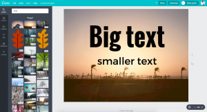
How easy is it all? These three slides took about five minutes: it would be faster once I knew what I was doing, of course ;) For most people, I suspect that’s at least on a par with the speed they use PowerPoint, so score one more point to Visme!