It’s Formula One season once more and as always I’m stunned by the way the drivers stay calm under pressure. Make a mistake there and it’s all over – perhaps permanently.
One of the ways they do it, of course, is by keeping their sense of perspective. Just like other athletes under pressure they concentrate on what they’re doing… not on the consequences. It’s no good concentrating on the race as a whole: instead, drivers concentrate on the corner in front of them, the car to be passed and the shortest line to be taken.
What’s this to do with presenting and public speaking? Everything. We often have people to our training courses who say “I’ve got a big presentation to come up and I can’t afford to get it wrong.†The problem is that just thinking like that makes it more likely you will get it wrong! The right approach is to concentrate on the presentation itself – not the effects of failure – just like the tennis player who’s Match Point up (or down!) or the F1 driver who’s got a notoriously difficult corner coming up.
Concentrate on what you’re doing and let the consequences work themselves out afterwards! Of course that’s easier said than done but the effort is worth it.
And while we’re talking about this, when Formula One coverage moved back from ITV to the BBC this season there was just a moment’s hesitation in my head about whether they’d make a good job of it. I know they used to do it, but even so… then I head the theme music (Fleetwood Mac’s “The Chainâ€) and I knew everything would be right. They’d kept the theme music from over a decade ago, and all was suddenly right with the world!
I’m often struck by how evocative simple things like music and images can be. They stick in your mind long, long after the hard-core facts-and-figures have leaked out of your memory.
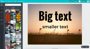
You can use this ‘emotional connection shorthand’ in your presentations pretty easily – all it takes is a striking (and appropriate!) image. Setting aside for the moment the technical issues of getting an image that looks good when projected, the key thing to look for is that the image you use should be simple and striking. Plain backgrounds (or at least soft focus backgrounds) are ideal – and whatever image you pick should be clearly and obviously interpretable.
All too often we see images which people want to use in their presentation that don’t capture the whole story in one glance – the key tip of today is pretty simple: if your images take more thinking about that a road traffic sign, they take too much thinking about. Your audience should be able to grab them instantly!
If your audience members have to think about your visuals, your images start to lose their impact and you might almost as well be using old-fashioned text!