I’ve spent a long time being self-indulgent recently, so I thought it might be useful to run through how one of my favorite slides evolved by way of redressing the balance :) ; it’s still not fixed in stone and may well change as/when/if I get the urge….
First things first – figure out what you want to say. In this instance I wanted the slide to capture the very basic things you need to make a decent presentation. I worked this out in the way I tend to do a lot… by using a simple spidergram to get all my ideas down onto the page in any old way. It’s more important tot get everything down than it is to get it right in the first instance – you can always impose formality later but trying to be too formal too soon inhibits the creative/cathartic process. I used a white-board in my office to do it but a large sheet of paper would do nicely – just remember to start somewhere near the centre of the page and don’t use too big a pen. (Otherwise there’s no point in using a bigger sheet of paper! ;) )
I’d go so far as to say you shouldn’t ever turst a mind-map that looks too neat! That means someone, somewhere, has cleaned it up!

This one, on Olivia Mitchell’s excellent “Speaking About Presenting” website looks ‘real’. I can’t show you mine because I didn’t think to photograph the whiteboard when I’d finished….
Okay, so once I’d got everything down I walked away. In fact I went off for a cup of tea (hey, I’m British, don’t you know! It’s what we do!) to forget about it for a while. When I came back it was with fresh eyes. The next step is easy – just change the colour of your pen and link things together that ‘go together’. The idea is to find three (or four at a push) of the big ideas/concepts that lie behind everything in front of you.
In an ideal world, you’d spot three concepts and you’d be able to categorise every word before you to one of those three ideas. For example, on our public training days I run through this exercise with people, using the subject of ‘Making a perfect cup of tea’. Often groups come up with the concepts of
- consumables – milk, tea, electricity etc.
- tools – kettle, teapot, mug etc.
- process – the things you do such as boiling the water, pouring the tea, letting it brew
There are other ways of categorising things of course – don’t let that list stop you doing your own. So, back to my slide: it turns out that I came up with a classification of only three items:
- you need all the necessary skills of presenting – the kind of things I train people in
- kit – things like your slides if you use them, projector, props, microphone if you need to use one
- something to say – and the urge to say it…. the right attitude, you could say.

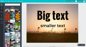
When you put that onto a slide, using PowerPoint’s (shocking bad) defaults, you get something a bit like this, perhaps, after a little thought…
…. hideous isn’t it!
And instantly forgetable.
To make it a little more “audience-friendly” I did some basic housekeeping: replace the title with a ‘headline’ if you can – something that captures the whole idea in just one catchy phrase and tidy up the bullet-points a little. The result is the kind of thing thats both still ugly as hell but also (sadly) what I see most of when I’m watching presentations…
 … and that’s where most people leave it.
Now for those of you who are new to designing slides, take a deep breath and do two things. Firstly, replace your headline with an image that captures the whole concept in the same way the headline does. Secondly, cut your bullet-points down to single words.
Image-wise, I went for something that was just as scary as making presentations: something that required the same three attributes – which by now I’d abbreviated to simply, skills, equipment, attitude. I looked around my hard-drive and found a picture of my daughter doing her first sky-dive. From two miles up you’ve got to have the right combination of skills, equipment and attitude, I’m sure you’ll agree. If any one of them is wrong, things are not going to end well, not well at all.  After much fussing around to get the image contrast right I ended up with this slide:
Much more attractive and much more memorable… in idea at least. Sadly the image doesn’t cut the mustard, so despite me being wedded to it because it’s person to me, and the time I’d spent trying to get the colours and brightness right (and so on!), the graphic had to go!
To be honest, that looks better on my screen than I expected, because when it’s projected it doesn’t look good at all – the contrast in the imagage isn’t up to the mark. I tried it out in front of a “tame” audience and didn’t get a good response – people were spending time figuring out what the image was, and what it was supposed to show: clearly it was mind-boggling-ly obvious but only mind-boggling-ly obvous to me. Maybe it’s because I’d been there when my daughter jumped out of the airplane! :)

A bit later, poking around google-images (and, I confess, a chat with my wife who made the suggestion of what to look for!) I came up with the idea of a space-walk. This is my current version of the slide: now doubt it will evolve more in the weeks ahead….. what do you think?