I seem to be spending a lot of my time reviewing things at the moment. Â My last one was a “Good, but….” kind of affair (and it was a big but! :) Â ). Â It’s nice that this one can be pretty much purely positive! Fotolia.com
Regular readers will know that I’m a strong advocate of using pictures in presentations – they’re less boring and more effective that streams of bullet-point slides so it seems a bit of a no-brainer for the serious presenter, to me. The question arises again and again, of course, about where to get images from that are of high enough quality and of the right subject matter… and to do so in a way that doesn’t cost you so much time you begin to lose the will to live while you search!
It’s an added bonus, as far as I’m concerned, if the images aren’t the standard ones you see a million times around the web!
Let’s start at the beginning and go through things formally…
Costs – I’ll get this one out of the way at the start because to be fair, I can’t really comment all that much on the cost of the pictures as I haven’t been paying for them for this review. Looking at them, they seem reasonable and in line with everyone else’s but I’ve not gone into this in anything more than a superficial basis. Â Me? Lazy? Guilty as charged.
Interface – smooth. Â I liked it at first sight. Friendly and informal with a style that I like. Response times were a bit variable but that could very easily have been at my end, so to speak. But here’s where I had my first problem…
On the other hand… I don’t know about you, but I tend to use sites like this by using the ‘search’ function.

Champagne
On the plus side it’s obvious, easy to use, and fast. Â On the downside I’m not sure it gives me the results I was expecting! Â On a whim, my first search was for ‘explosion’. The first image I was offered was a heavily photoshopped image of a semi-distant city and the second was this image of champagne flutes. Â It’s a lovely image, absolutely lovely, but…. … but what the heck has it got to ‘explosion’?
A few rows of images down there are fireworks and so on, which I could just about see as linked to ‘explosions’ but seriously… Champagne flutes? Eh?
Taken a bit by surprise by this, I went for something more traditional in my next search “microphones”. Â The results this time were stunning – simply stunning. Â Stunning to the point that I downloaded one of the images with a view to using it in a slidedeck I have because it’s better than the image I have in there right now by quite some way. I’m not sure what more I can say by way of praise: I’m going to change my slides to include this image.
I tried a few other searches and came away pretty impressed overall.
Downloads are a little clunky at first but once you get into the right way of thinking, very simple.
The images themselves – well what can I add to the comments above about downloading a microphone image? Well, some general impressions, I guess. There’a fair smattering of naff images – particularly if you search on something that is likely to attract naffness, such as ‘motivation’. Do this and you’ll get the usual stuff like a clockface counting down to midnight with the text ‘the future is now’.
Pass the sick-bucket, please.
You’ll also get some stunning stuff. And I really mean stunning.
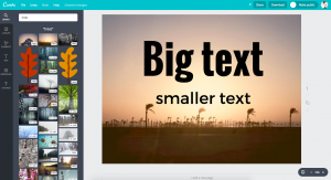
Not only is the resolution good but the contrast is generally excellent – at least on the pics I looked at – which is important for a presenter like me, because data projectors often leach colour out of images. An additional advantage from my perspective, is that a significant number of the images I looked at had a ‘sensible border’ from a presenters point of view. What do I mean by a sensible border? Â Something that I can blend into my slides using something like Instant Alpha to make colours transparent.
The advantage is that the image doesn’t just sit there, looking like a semi-intended transplant on your slide, the way the image above does on this review! :)
Size choices were sensible and resolution was good enough to print.
What more can I say?
Odds and ends – to the left of the screen, as you look at your images is the similia box. I haven’t bothered to look at the technology behind it, but it claims to be looking for images you might find useful, based upon your search history. Â It did a reasonable job too.
All in all? – a few quibbles but I loved it.

Hello, I will definitely be following your blogs. I attended your Divn’t panic, present like a professional one day programme in March at the Thistle.
The one thing I have been concerned about is presenting professionally on a very emotional subject. Your techniques have worked, last Thursday along with a colleague did five presentations in a row. Hard work, emotionally draining but very very rewarding and the feedback was brilliant.
Thank you for you help so far I am sure there is a lot more I can go on learning from you.
Kind Regards
Pam,
Hello Pam – lovely to meet you here. Fantastic that the day worked so well for you. If I remember rightly, you were on the course where Claire was taking the pictures – is that right?
I agree, Simon.
High quality pictures and very little, if any, text, is the way to present. YOU supply the text.
I like this site for great pictures: http://www.istockphoto.com/
This site has some FREE pics, but you need to, and should, give attribution: http://www.flickr.com/creativecommons
Thanks for the Post!
hints, tips and articles ~ to improve the impact your presentations makeRegular readers will know that I